Zalando
Helping one of the world's biggest fashion brands make its corporate website live up to its brand, through a repeatable method: evidence, diagnosis, a bold vision, and a phased path the team can actually run.
Overview
A strong brand, and a corporate site ready to match it.
Zalando's corporate website carries genuinely valuable content, investor relations, newsroom, careers, sustainability, and sits behind a brand with real confidence and craft. The opportunity was simple to state: help the site feel as connected, expressive, and self-assured as the company behind it.
My role was to lead the strategy, bringing a repeatable method that turns evidence into a clear direction, and a plan the team can run.

My approach
A method that turns evidence into a plan.
Big brands don't need another list of problems, they need clarity. So I ran the same method I bring to any strategic audit: gather the evidence, find the story, set the vision, and sequence the path.
Evidence
Audit 80+ pages across four lenses: UX, architecture, performance and accessibility, and measurement. Grounded in real data, not opinion.
Diagnosis
Cluster dozens of signals into a few root themes and one clear story, so leadership aligns on what actually matters.
Vision
Define what the site could be, and make the case emotionally with an editorial direction, not just logically.
Phased path
Turn the vision into a roadmap the team can run within real constraints, quick wins first.
The diagnosis
Many signals, one opportunity: connection.
The audit surfaced plenty to build on, and one clear theme. The site had grown org-first, so its sections, templates, and journeys weren't yet pulling in the same direction. The single biggest opportunity was connection: joining it all into one confident, task-first experience, because connection is what earns trust.
- Turn a dense mega-menu into clear, task-first hubs with proper wayfinding
- Unify fragmented templates into one consistent, reusable system
- Strengthen the foundations: faster pages, accessibility, and reliable measurement
- Add moments of delight for high-value audiences, and let the brand show
The site works. It fulfils its duties. It just hasn't stepped into its role yet. Our job was to help it get there: expressive where it matters, and confident enough to lead.
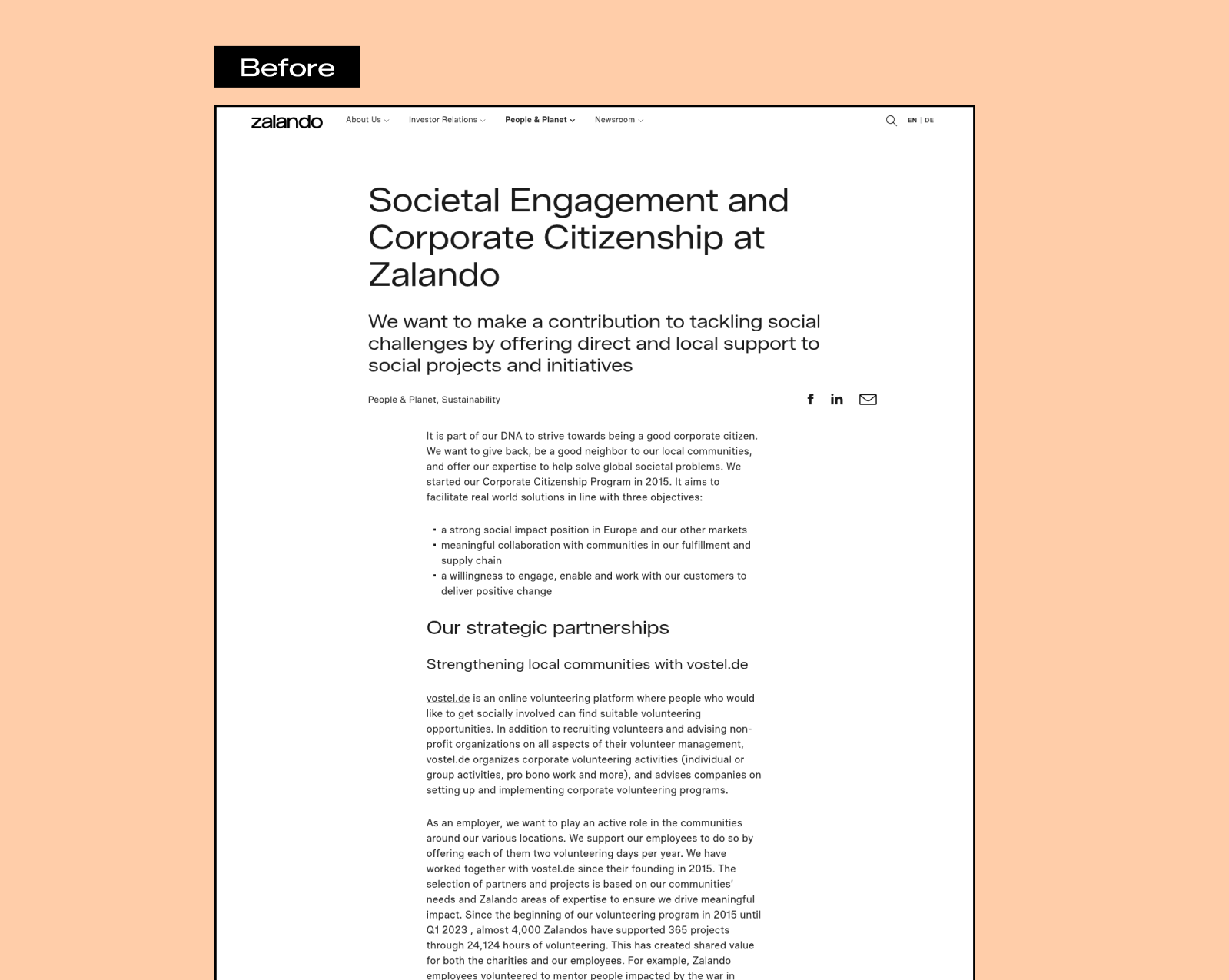
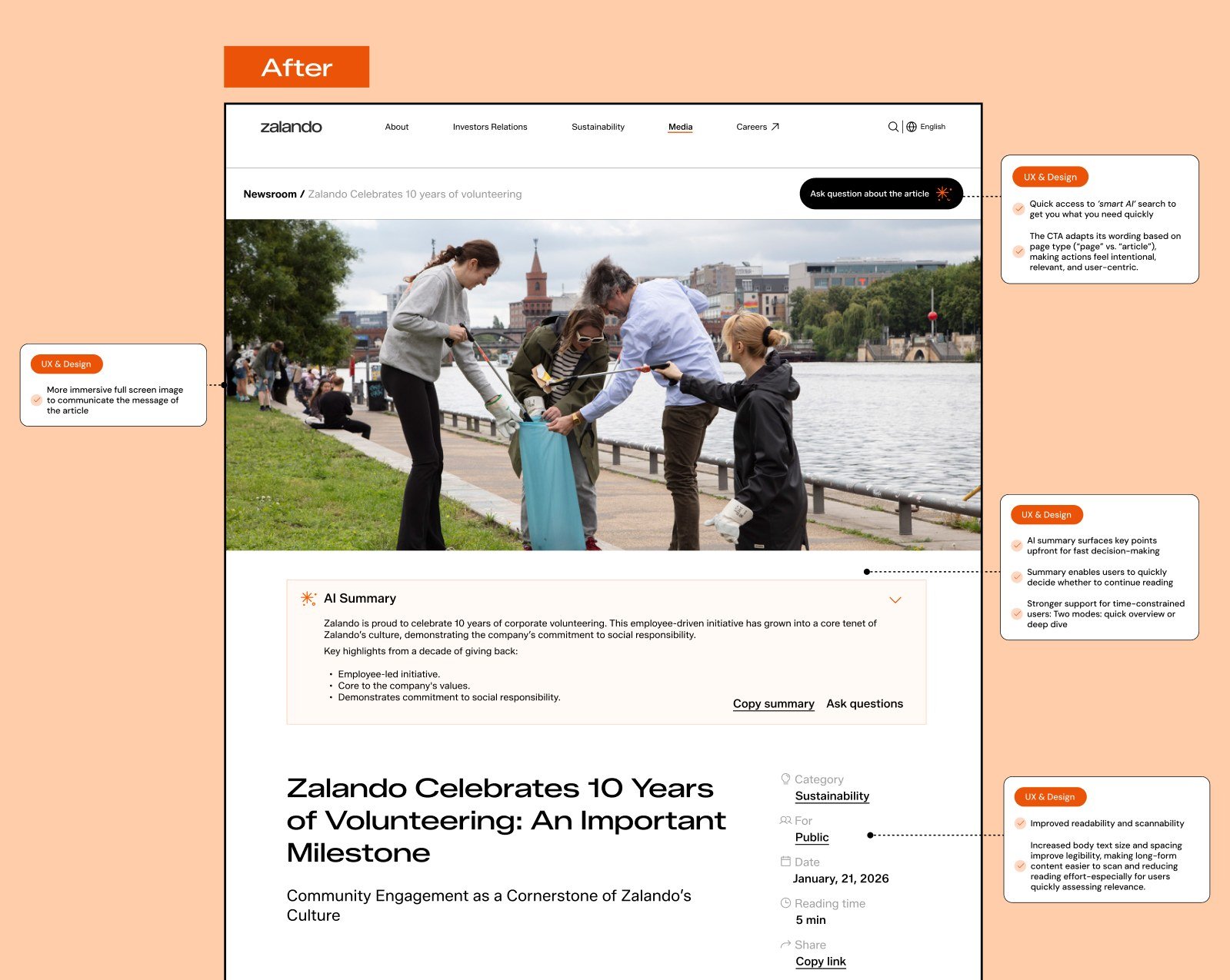
The same content, reimagined: immersive imagery, an AI summary, cleaner hierarchy, and intent-aware actions.
The vision
From providing information to leading.
The most exciting part of the work was answering a bigger question: what could this site be? The direction, stop simply providing information and start leading and inspiring. Pair Zalando's own fashion photography with a confident editorial voice, so the corporate site finally feels unmistakably like Zalando.
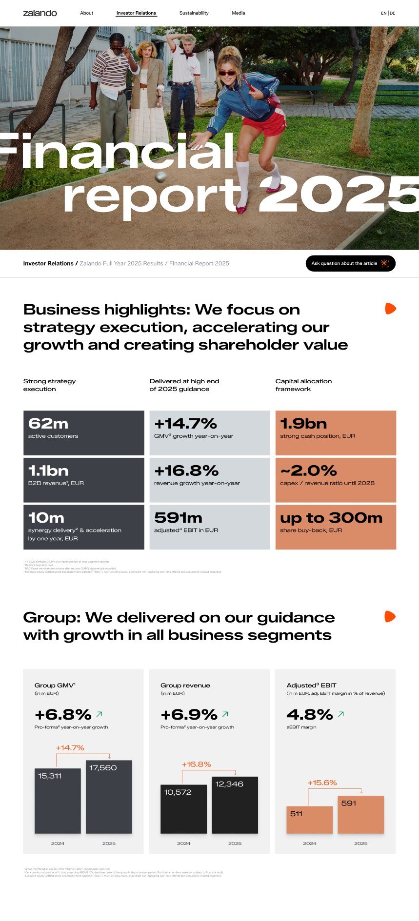
From fragmentation to a harmonised whole. The site doesn't become someone else. It just steps fully into who it already is.
The phased path
A vision the team can run, starting now.
The plan was deliberately not an immediate re-platform. Quick wins first, accessibility and template fixes within today's setup, then platform improvements, then longer-term consolidation. Momentum without waiting on a migration.
A clearer information architecture
Reworking the org-first structure into task-first hubs. We mapped the current site against two conceptual directions, "merged and lean" versus "scaled and distributed", so the team could choose with eyes open.
A minimal template set and shared components
Everything collapses into a small family of reusable templates and shared components, navigation, cards, filters, media, structured metadata, so content becomes discoverable, reusable, and measurable across the site.
A roadmap the team can actually run
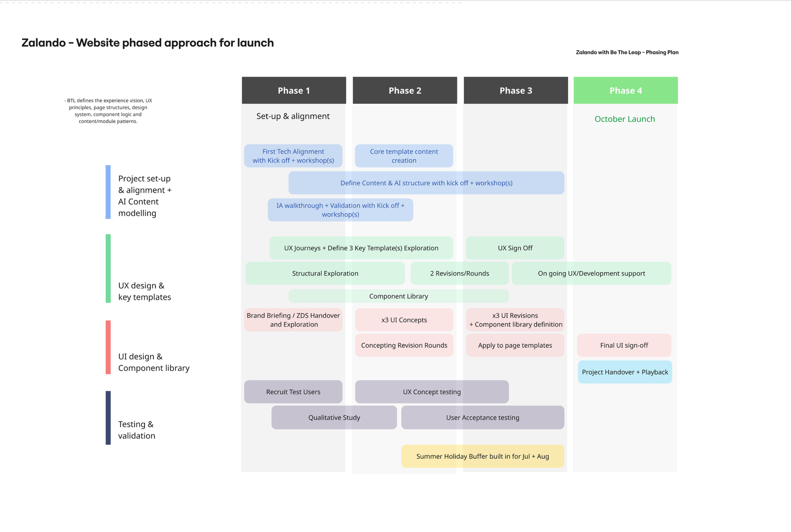
A phased launch plan across four phases and five workstreams, from set-up and AI content modelling, to UX and templates, to UI and the component library, to testing, with a summer buffer built in and a clear launch date.
The outcome
A shared, evidence-based picture of the site across 80+ pages
One clear story the whole team could rally behind: from fragmentation to connection
A bold, on-brand visual direction that made the vision tangible
A minimal template set and shared component library to build on
Revised information architecture and sitemap options
A phased roadmap the team can run, quick wins first